Imagine building a Lego castle. If you glue the pieces together, you cannot change the layout later without breaking the whole thing. But if you use a smart system where pieces snap into place and shift colors instantly, you can rebuild that castle into a spaceship in seconds.
That is exactly what happens when you combine Figma variables with component slots. You create a design system that does not just look good, but also thinks, scales, and adapts to any change you throw at it. Let us dive into how you can master these two powerhouse features to build an unstoppable design system.
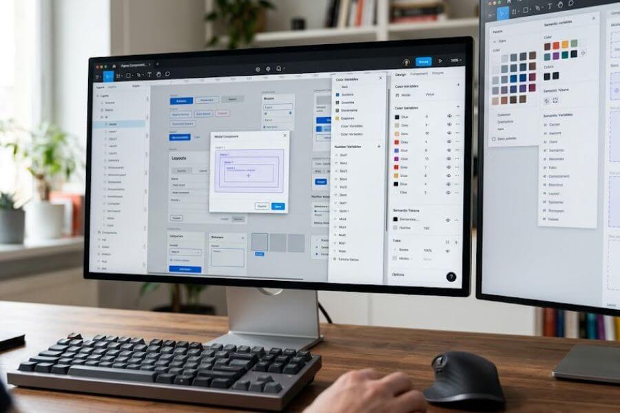
The Power of Figma Variables
Variables are the brain of your design system. They store specific values like colors, spacing numbers, or visibility rules, and let you apply them across your entire project. When you change the value in one central place, every single design element updates instantly.
Understanding the Four Types of Variables
Figma gives you four distinct flavors of variables to play with. Each serves a unique purpose in your UI toolkit:
- Color Variables: These handle your design palette. You can map them to fills, strokes, and backgrounds. They are essential for setting up themes.
- Number Variables: These control sizing, padding, gap distances, and corner radiuses. They keep your spatial grid completely uniform.
- String Variables: These store text values. They are incredible for managing localization, translating copy, or switching button labels across states.
- Boolean Variables: These are simple true-or-false toggles. They control whether an element is visible or hidden inside your components.
Setting Up a Multi-Tier Variable Architecture
To build a truly scalable system, you cannot just throw all your variables into one big bucket. You need a clear structure. The most robust approach uses a three-tier system that separates raw values from their actual meaning in your user interface.
Primitive Tokens
This is your foundation. Primitive tokens hold raw values. You name them exactly what they are, without worrying about how or where they will be used. For example, a primitive color variable might be named blue-500 with a specific hex code. A primitive number variable might be space-16 with a value of sixteen pixels. You rarely apply primitive tokens directly to your final designs; instead, they feed into the next layer.
Semantic Tokens
Semantic tokens add meaning to your primitives. They answer the question: What does this value do? Instead of using blue-500 on a button, you create a semantic variable named color-text-brand-primary and point it to blue-500. If your brand decides to change from blue to purple next year, you only have to update the primitive token. Your semantic token remains untouched, and your entire application updates seamlessly.
Component-Specific Tokens
This is the highest level of detail. Component tokens bind semantic tokens to specific elements inside a single component. For instance, you might create a variable named button-primary-background-default that points to your semantic brand color. This gives you ultimate control, allowing you to tweak a button background without accidentally changing a navigation bar background that shares the same semantic color.
Variable Collection Organization
| Token Tier | Naming Style | Purpose | Example |
| Primitive | color-red-500, scale-8 | Raw values, no context | #FF0000, 8px |
| Semantic | bg-surface-critical, radius-card | Defines function and meaning | Maps to color-red-500 |
| Component | alert-banner-bg, button-padding-x | Absolute control over one item | Maps to bg-surface-critical |
Mastering Variable Modes for Theming
Variable modes allow you to change the values of your variables depending on the context. Think of modes as parallel universes for your designs. The layout stays the same, but the data inside shifts based on the world it is living in.
Creating a Seamless Light and Dark Mode
The most common use case for modes is switching between light and dark themes. When you set up your semantic collections, you can add a new mode column in your variables panel.
Under the “Light” column, your bg-surface-primary variable might map to a white primitive color. Under the “Dark” column, that exact same semantic variable maps to a dark gray primitive color.
When you build a screen, you do not need to manually swap out components or colors to show a dark mode option. You simply select your frame, go to the layer panel, and switch the variable mode from Light to Dark. Figma handles the rest, instantly swapping every mapped color on the fly.
Responsive Design and Spacing Modes
Modes are not just for colors; they work wonders for layouts too. You can create a spacing collection with modes for “Desktop,” “Tablet,” and “Mobile.”
In your Desktop mode, your gap-container variable might be set to thirty-two pixels. In your Mobile mode, that same variable drops to sixteen pixels. When you move a card component from a desktop frame to a mobile frame, Figma automatically adjusts the padding and spacing based on the frame mode, making responsive layout design feel like magic.
Multi-Language and Localization Modes
By using string variables, you can test how your layouts handle different text lengths before a single line of code is written. Create a string variable for your main headlines and button copy. Add modes for English, Spanish, and German.
When you toggle the mode on your design screen, the labels swap languages instantly. This lets you see right away if a German word breaks your button layout or overlaps with an icon, giving you the power to fix spacing issues early.
Advanced Variable Techniques and Logic
Once you have the basics down, you can start combining variables to create highly dynamic prototypes that feel like real, working software.
Aliasing and Cross-Collection Linking
Aliasing is the act of linking one variable to another. To connect your semantic layer to your primitive layer, you right-click the value square in your variable panel, select “Create alias,” and choose the primitive token.
You can also link variables across entirely different collections. For example, you can link a component-level spacing variable to a spatial-grid collection variable. This creates a chain of command that protects your design integrity.
Scoping Variables to Prevent Mistakes
As your design system grows, your list of variables can become overwhelming for other designers on your team. Figma allows you to scope your variables so they only appear where they belong.
You can click the settings icon next to any variable and check or uncheck specific options. You can make sure a color variable only shows up for fills but never for text strokes. You can scope a number variable so it only appears in the gap or padding fields, keeping your team from accidentally applying a corner radius value to a layout grid gap.
Using Number Variables for Dynamic Corner Radiuses
Instead of typing custom values into every card, button, and input field, you can map your corner radiuses to your number variables. You might have an outer-radius-large variable for container cards, and an inner-radius-small for buttons inside those cards.
By nesting these variables, you keep a perfect visual balance across your app. If you decide your product should shift from a sharp, boxy look to a round, modern aesthetic, you update your foundational radius variables, and your entire interface rounds out beautifully.
The Concept of Component Slots
Components are reusable design elements, but sometimes they are too rigid. If you build a modal component with a text field inside it, and a teammate needs that same modal but with an image inside instead, they are stuck. They might detach the component, which breaks its link to the design system. This is where component slots come to save the day.
What is a Component Slot?
A slot is a placeholder inside a component. It is a designated “empty seat” that says, “You can put whatever content you want right here, while keeping the outer shell completely intact.” Think of a slot as a frame that is built to be replaced. By using slots, you can build one master modal frame, one master dashboard card, or one master navigation drawer, and allow other designers to inject custom content into them without breaking the main component structure.
Why Slots Are Crucial for Large Systems
Without slots, design systems suffer from component bloat. You end up creating a “Modal with Text,” a “Modal with Image,” a “Modal with Form,” and a “Modal with Video.”
This makes your asset panel cluttered and incredibly difficult to maintain. If you want to change the corner radius or the close button of your modal, you have to fix it in four different places. With a slot-based system, you build the modal shell exactly once, and your team populates the inside dynamically.
Anatomy of a Slot-Based Component
- The Shell Component: This contains the permanent structural pieces. For a modal, this includes the background overlay, the card container, the header title, the close icon, and the bottom action buttons.
- The Slot Placeholder: A simple instance nested inside the shell layout. It is often styled with a bright, dashed border and clear text labeling it as a placeholder, making it obvious to other designers that this area is meant to be swapped out.
- The Content Instance: The actual design layout that a designer creates separately—like a form, a product list, or a success message—which will be dropped into the slot placeholder.
Step-by-Step Guide to Building Component Slots
Let us walk through the exact process of creating a fully functional, flexible slot system using Figma instances.
Step One: Create the Placeholder Slot
Start by drawing a frame. Give it a clear name like _Internal / Slot Placeholder. The underscore at the beginning keeps it hidden from the team asset library, so people do not accidentally use it as a standalone piece.
Style it with a distinct look—perhaps a light background, a dashed stroke, and a text layer in the center that reads “Swap Me.” Turn this frame into a component.
Step Two: Build the Shell Component
Now, create your main component, such as an accordion drop-down or a pop-up window. Arrange the layout using auto-layout. Drop an instance of your _Internal / Slot Placeholder right into the area where the dynamic content needs to live.
Set the horizontal and vertical resizing constraints of the placeholder to “Fill container” so it expands or shrinks to match whatever size the shell becomes. Turn this entire arrangement into your main public component.
Step Three: Create Your Custom Content Pieces
Elsewhere on your canvas, build the actual content layouts your team will need. For instance, you could build a subscription form layout, an image gallery layout, or a simple text paragraph.
Turn each of these custom layouts into their own separate components. It helps to organize them in your files under a clear category like Modal Content / Form.
Step Four: Execute the Swap
Bring an instance of your main shell component onto your design playground. Click deep into the layers until you select the nested _Internal / Slot Placeholder instance.
Go to the right-hand design panel, look for the instance swap drop-down menu, and select your new custom content component. The placeholder disappears, and your custom layout snaps perfectly into its place, adapting seamlessly to the auto-layout rules of the parent shell.
Combining Variables and Slots for Ultimate Scalability
When you marry variables and slots together, you unlock the ultimate level of design system architecture. Variables control the look, feel, and context of your designs, while slots control the structure and content layout. Together, they make your components incredibly adaptive.
Building an Adaptive Dashboard Card
Imagine creating a dashboard card shell component. It has a header line and a three-dot menu icon. Below the header, you place a component slot placeholder.
You control the padding of this dashboard card using number variables linked to your global spacing grid. You control the background color of the card with a semantic surface variable that supports both light and dark modes.
Injecting Diverse Content Layouts
Because you used a slot, one designer can swap the placeholder for a line chart component to show sales trends. Another designer can swap that same placeholder for a bulleted list component to show recent user activities.
Both cards look perfectly uniform because they share the exact same structural shell, the same variable-driven padding, and the same color theme responses.
Managing Variations without Friction
If your product team decides that all dashboard cards should have a softer appearance, you update your corner radius number variable. If they want a more compact view for data-dense displays, you switch the frame variable mode to your compact spacing profile.
The card shell adjusts, and the injected content—if built with the same design system variables—scales alongside it effortlessly. Nobody has to manually rebuild their specific dashboard layouts because the updates cascade smoothly through the slot system.
Best Practices and Avoiding Pitfalls
Building a complex design system can sometimes lead to messy files if you are not careful. Keep these rules of thumb in mind to ensure your system remains smooth, intuitive, and enjoyable for your team to use.
Documenting Your Slot Subsystems
Always provide clear instructions for your team. Use Figma description fields on your components to explain how a slot should be utilized.
You can add a brief note like: “Swap the placeholder layer with any component from the Content library.” This keeps junior designers or new team members from feeling lost when they first interact with your flexible components.
Keeping Naming Conventions Crystal Clear
Consistency is your best friend when it comes to naming variables and components. Stick to a clear syntax like category-subcat-element-modifier for your tokens.
For your internal slots, always use a prefix like an underscore or a period so they do not clutter up the global search when designers are looking for main components to use in their daily work.
Preventing Over-Engineering and Complexity
It can be tempting to turn absolutely everything into a variable or a nested slot. Do not fall into this trap. If a component is simple and its content never changes—like a toggle switch or a small badge—it does not need a slot.
Only use slots for items that genuinely require layout flexibility. Keep your variable counts focused on tokens that truly drive consistency, rather than mapping every single pixel value to its own custom name.
Frequently Asked Questions
Will using too many nested slots and variables slow down my Figma files?
Figma handles variables and instances extremely well, but heavy over-nesting can impact performance on massive files. To keep your files running fast, avoid nesting slots deeper than three layers deep, and clean out any unused variables or old draft components regularly.
Can I restrict which components can be swapped into a specific slot?
Yes, Figma offers a powerful feature called instance swap properties. When you select your slot placeholder inside the main component, you can create an instance swap property and define a specific list of approved components or folders. This guides your team to swap in only the appropriate layouts, preventing accidental mistakes.
How do I handle developer handoff for components that use advanced slots?
Communication is key during handoff. Show your developers the shell component and the content layouts separately. Explain that the slot represents a dynamic child container or prop in code, such as children in React. This matches how developers actually build modular code, making your design system highly compatible with engineering workflows.
Should I create a separate variable collection for every single component?
No, that can quickly become a maintenance nightmare. Start with a foundational global collection for primitives and a semantic collection for global UI roles. Only create a component-specific variable collection when you have a complex element—like a multi-state navigation bar—that needs ultra-fine control separate from the rest of your app.


